This Monday, July 27 · 7 PM — Parents’ meetup in Santo Domingo Free registration →
Brand kit

papas.academy, on one page

The official mark is C1 — infinity eyes and a smile on a door-blue container, brand direction «midday». This page gathers every piece needed to use it right: the logo in its formats, versions in other languages, color, typography, monochrome versions, and the contact QR codes.

The source files and the generator that produces all of this live in brand/ in the repository — this page is their living mirror on the site.

The logo

Infinity eyes, parenthesis smile

The square door-blue container holds a face built from two strokes: the eyes, a continuous lemniscate that reads as attention and connection; the smile, the one mango-colored stroke in the whole identity.

Logomark
LogomarkAvatar, favicon, seal.
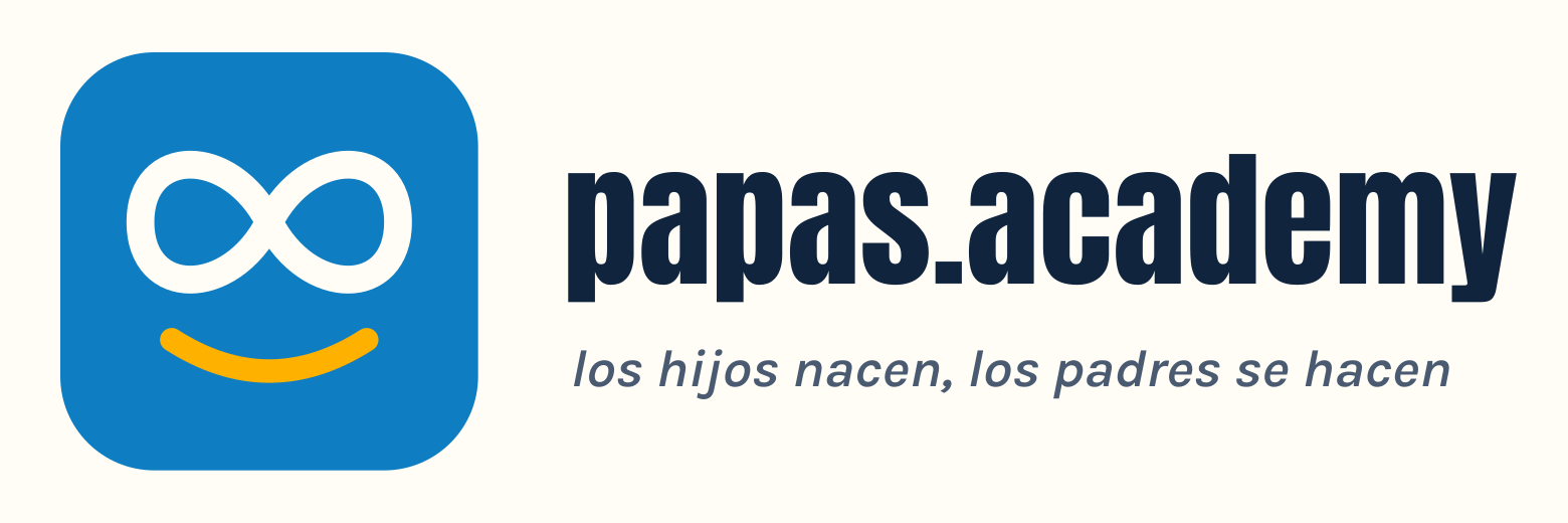
Horizontal lockup, white background
Horizontal — white backgroundHeaders, documents, email signature.
Horizontal lockup, transparent background
Horizontal — transparentOver photo or brand color.
Vertical lockup, white background (element card)
Vertical — white backgroundElement card: covers, social, sponsor deck.
Vertical lockup, transparent background (element card)
Vertical — transparentElement card over any background.
Wordmark
WordmarkWhen the badge is already present or space is tight.

Minimum size: badge 24 px, horizontal lockup 140 px wide. Minimum clear space around it: the thickness of the container itself. Always deliver externally as PNG.

The blinking accent

The accent on «papás» blinks on and off — papás/papas, fathers/parents-of-any-gender — the diacritic that gives the Spanish word «papás» (fathers) its double reading with «papas» (parents, plural). That typographic gesture IS the project's positioning, turned into a 4-second animation. It's also the direction that travels best to TikTok/YouTube and to younger audiences.

Animated GIF, to copy or download

Same gesture, same rhythm (4.5 s, hard cut — no fade, the accent snaps on and off) in eight combinations. Right-click → "copy image" to paste straight into a document or chat, or use the link to download the file.
Animated GIF — color, dark text, white background
Color · dark text · white backgroundDownload
Animated GIF — color, dark text, transparent background
Color · dark text · transparentDownload
Animated GIF — color, white text, black background
Color · white text · black backgroundDownload
Animated GIF — color, white text, transparent background
Color · white text · transparentDownload
Animated GIF — dark monochrome, white background
Dark monochrome · white backgroundDownload
Animated GIF — dark monochrome, transparent background
Dark monochrome · transparentDownload
Animated GIF — white monochrome, black background
White monochrome · black backgroundDownload
Animated GIF — white monochrome, transparent background
White monochrome · transparentDownload
Other languages

A universal mark, a motto that translates

«papas.academy» is not translated — it's multilingual and universal by design. Only the motto under the lockup changes, always using the site's canonical translation.

Lockup in Spanish
es«los hijos nacen, los padres se hacen»
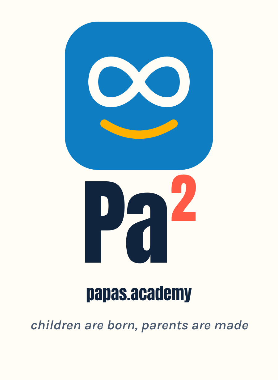
Lockup in English
en«children are born, parents are made»
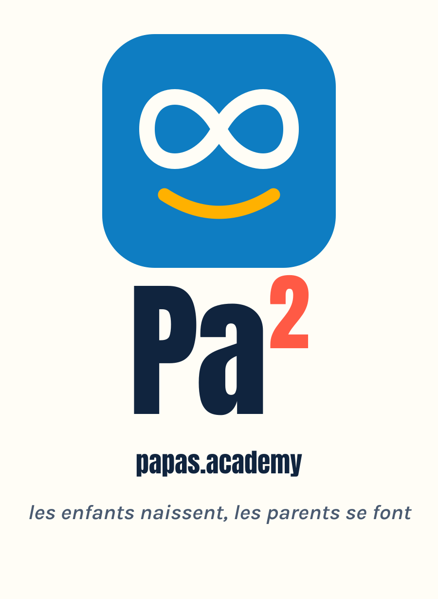
Lockup in French
fr«les enfants naissent, les parents se font»
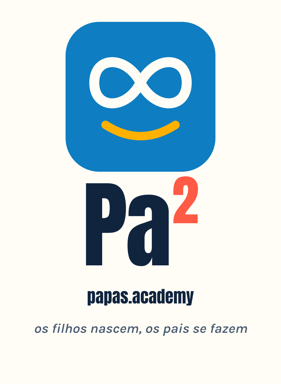
Lockup in Portuguese
pt«os filhos nascem, os pais se fazem»
Color

Caribbean midday, at full sun

Full-saturation color over bright white, one large field per screen — if everything shouts, nothing is heard.

blanco#FFFDF6
noche#10243E
mar#0E7DC2
mango#FFB100
palma#0B8457
coral#FF5A45
PairWCAG ratioUse
noche on blanco15.35:1 · AAAGeneral text
blanco on noche15.35:1 · AAAFooter, dark surfaces
noche on mango8.59:1 · AAAText on mango fields
blanco on palma4.63:1 · AAButtons, text on palma fields
blanco on mar4.36:1 · large text/UI onlyLarge headlines, icons
blanco on coral3.03:1 · large text/UI onlyShort labels, never paragraphs
Typography

Poster + conversation

Display · Anton
your child doesn't need a perfect parent — they need a present one
Body · Karla 400–800
Karla carries the conversation: rounded without being childish. Headlines shout like a fair poster; the body speaks like a friend.
Components

The system in use

Two real pieces of interface, not mockups: the activity card (color band + facets) and the «one question, six perspectives» panel — color and typography working together.

train together, for real

not "taking the kid to practice": both of you train, fixed schedule, real goals, the same sweat.

6–18routinebodyfree
panel — one question, six perspectives

the evidence voice«what the screen-time data says at age 4 is less alarming than you think…»

the play voice«what if the question isn't how much to limit, but what to do instead?»

the practical voice«I'm a single mom: the perfect plan isn't on the menu. here's what actually works…»

Voice & imagery

This direction's rules

Color instead of photos

The color fields and poster typography carry the whole identity — the founder's child's privacy (§9.3) solved by design, with no need for images. That doesn't mean never using photos: when they make content more appealing, they're used normally — the system is simply built so no piece depends on having one.

Lowercase with purpose

papas.academy in lowercase is digital-native and disarms institutional solemnity: nobody here lectures you.

When there's photography

Latino/Caribbean features, warm-climate clothing. Never identifiable children without explicit approval, never smiling stock-photo families.

Risk accepted

Volume: at full saturation, white and «noche» carry the editorial calm. One large color field per screen — discipline, not decoration.

Monochrome

Four combinations, one color

For single-ink printing, engraving, stamps, or watermarks. The transparent versions drop the container and use only the «bare mark».

White on black
White on black
Black on white
Black on white
White on transparent
White on transparentBare mark, dark backgrounds or photo.
Black on transparent
Black on transparentBare mark, light backgrounds.
QR codes

Six variants, always to papas.academy

Error correction level H — the centered logomark never breaks the scan.

Colorful QR
ColorfulGeneral use.
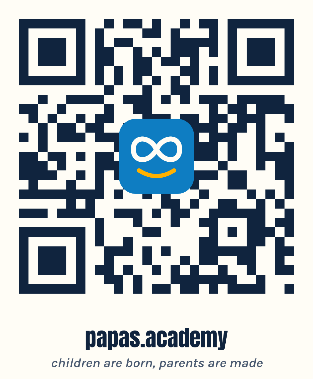
Colorful QR with caption
Colorful, with captionWhen the QR stands alone.
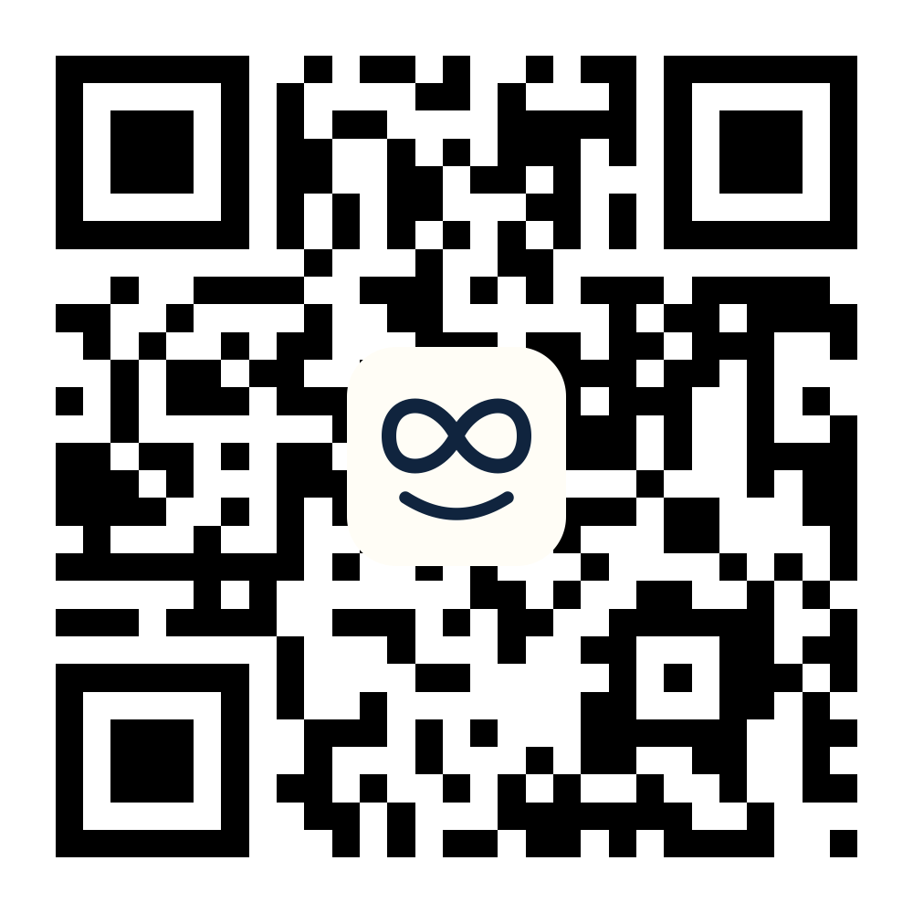
Black on white QR
Black on whiteSingle-ink printing.
White on black QR
White on blackDark backgrounds, merch.
Black on transparent QR
Black on transparentOver photo or light color.
White on transparent QR
White on transparentOver photo or dark color.

every source file and the generator live in brand/ in the repository